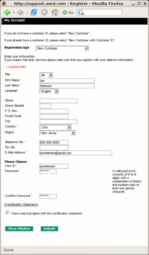
 After about 20 minutes of really trying to register at AMD's support site, I've come to the conclusion that it's just not possible. No matter what values I place into the form, I am always brought back to the same page with the *=required field message. I finally broke down and called them on the phone. Of course, I wasn't able to talk to a real person until an automated message walked me through all of the great, easy, convenient, and time-saving features available at their newly re-designed web site.
I have a feeling that I'm not alone in my frustration.
Web forms should be easy. There is no excuse for a web designer (or a developer given the task of designing the usability and look of a form, which too often is the case,) to design something like this. This is not 1995. We have tools, we have experience, heck - we're even getting paid more than ever (OK, not as much as 1999, but you know what I mean.) Did these people not try their final product? Did something else break that's causing the application to act stupid? Maybe I'll never know the answer to these questions, but I now keep this experience in the back of my mind when I'm given the task of designing a web form.
Feeling the need to write something about the simple usability of web based forms seems a bit odd to me, as we have all been using them for the past 10 years. But apparently, this type of writing is still warranted, as non-usable forms like those found at AMD are still being developed today. And we all know that AMD of all people should have their shit together.
What's missing from AMD's forms?
Well, besides the fact that they don't work, the user isn't given any feedback. Feedback is the most essential element when trying not to frustrate a user. Keep in mind though, that too much feedback is almost as bad as no feedback at all. So we need to find a happy median. A simple combination of textual and, more importantly, visual feedback will have our users keeping their heads on straight.
Textual feedback
This one is easy. Just give the user a list of things that's wrong with the form. This requires that each field is given a label (a good idea anyway.) Let's set up an example form that loosely follows a typical account creation form:
Now, some would argue that some instruction is warranted at this point. For example, letting the user know that the e-mail address must be in the xxx@xxx.com format, or that the telephone number must be in xxx-xxx-xxxx format. Let's see how something like that would look:
Admittedly, some of these examples are a bit extreme (like the 100 character limit,) but the point is that this clutter is simply not necessary. If they enter the e-mail address in the wrong format, we'll let them know at that point. 99% of the time, we won't get to that point. The only place I feel this is warranted in our example here is the password field. Since the higher-up, figure head, pointy haired people come up with the craziest requirements for what they see as an acceptable password, we should let the user know ahead of time what will fail validation.
Imagine the following situation:
It's pretty obvious what's going on here. The user is notified of the exact problem locations. This is good. A lot of sites fail to even get this far.
Visual Feedback
On our simple form, the textual description might be enough for the user to find and correct the problem in a short amount of time. But what if the form was complex (think IRS 1040.) How can we make the location of the problem incredibly obvious? How about this:
If you can't figure out what the problem is now, then its hopeless. This is where we want to be. To the point where the user simply has no doubt how to proceed. I'm sure there are many alternatives to what I've described above that will have the same effect. Just make sure your form is dummy-proof. It's easy. It's cheap. And it will make for a much more enjoyable on-line experience for your users.
p.s. I do realize that this post has a complete disregard for any and all accessibility issues (like color blindness.) I have no experience in this area, and am not one to give advice regarding it.